Android Compose : Texfield Validation and Password
Textfield is not perfect without any validation. Validation is needed so that the input complies with the rules and requirements and the application becomes more reliable and data consistent. As will be discussed in this article, we will discuss email and password validation which are common forms, especially for login and registration.
if you are still a beginner in jetpack compose and textfield, you can visit the first content about textfield https://www.modtion.id/posts/android-compose-textfield
Before we start code, we need to implement some library for icon and compose. In current version of compose, there is some code that don't exist in custom TextField. Open file in app/build.gradle.kts and code below and sync now.
plugins {
    ...
}

android {
    ...
}

dependencies {
    ...
    implementation(platform("androidx.compose:compose-bom:2023.06.01"))
    implementation("androidx.compose.material:material-icons-extended")
}
We will use viewModel and create textfield component to avoid boilerplate code. Here is the code that you can use for implementing textfield validation :
ViewModel
class TextFieldViewModel: ViewModel() {
var emailValue by mutableStateOf("")
private set
var emailError by mutableStateOf("")
private set
fun setEmail(value: String){
emailValue = value
}
var passwordValue by mutableStateOf("")
private set
var passwordError by mutableStateOf("")
private set
fun setPassword(value: String){
passwordValue = value
}
private fun validateEmail(): Boolean {
val email = emailValue.trim()
var isValid = true
var errorMessage = ""
if (email.isBlank() || email.isEmpty()) {
errorMessage = "Please fill email field"
isValid = false
} else if (!Patterns.EMAIL_ADDRESS.matcher(email).matches()) {
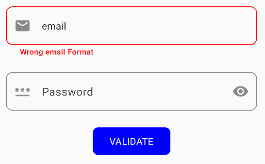
errorMessage = "Wrong email Format"
isValid = false
}
emailError = errorMessage
return isValid
}
private fun validatePassword(): Boolean {
val password = passwordValue.trim()
var isValid = true
var errorMessage = ""
if (password.isBlank() || password.isEmpty()) {
errorMessage = "Please fill password field"
isValid = false
} else if (password.length < 6) {
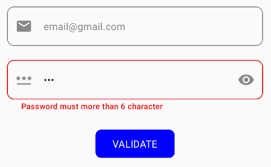
errorMessage = "Password must more than 6 character"
isValid = false
}
passwordError = errorMessage
return isValid
}
fun validateForm() {
if (validateEmail() && validatePassword()) {
// NEXT STEP
}
}
}According the code above, there are 2 validations for email and password. For email format validation, we can use this code
Patterns.EMAIL_ADDRESS.matcher(email).matches()
TextFieldValidation Component
Texfield in compose doesn't include error message. So, we need add Text for error message manually below TextField and create handler to show that error message. This component has feature for Password TextField that will control password visibility.
@Composable
fun TextFieldValidation(
    value: String,
    placeholder: String,
    onChange: (String) -> Unit,
    isError: Boolean,
    icon: ImageVector,
    errorMessage: String,
    isPassword: Boolean = false,
    imeAction: ImeAction = ImeAction.Next,
    keyboardType: KeyboardType = KeyboardType.Text,
    modifier: Modifier = Modifier
) {

    var showPassword by rememberSaveable { mutableStateOf(false) }

    Column(
        horizontalAlignment = Alignment.Start,
        modifier = modifier.fillMaxWidth(),
    ) {
        OutlinedTextField(
            value = value,
            onValueChange = {
                if (!it.contains("\n"))
                    onChange(it)
            },
            placeholder = {
                Text(text = placeholder)
            },
            singleLine = true,
            textStyle = MaterialTheme.typography.bodyMedium,
            leadingIcon = {
                Icon(
                    icon,
                    contentDescription = "Text FieldInput",
                    tint = Color.Gray,
                    modifier = Modifier
                        .size(24.dp)
                )
            },
            trailingIcon = {
                if (isPassword){
                    Icon(
                        if (showPassword) Icons.Default.VisibilityOff else Icons.Default.Visibility,
                        contentDescription = if (showPassword) "Show Password" else "Hide Password",
                        tint = Color.Gray,
                        modifier = Modifier
                            .size(24.dp)
                            .clickable { showPassword = !showPassword }
                    )
                }else {
                    null
                }

            },
            modifier = Modifier
                .fillMaxWidth(),
            keyboardOptions = KeyboardOptions(
                keyboardType = keyboardType,
                imeAction = imeAction
            ),
            colors = OutlinedTextFieldDefaults.colors(
                unfocusedTextColor = Color.Gray,
                unfocusedBorderColor = Color.Gray,
                focusedTextColor = Color.Blue,
                focusedBorderColor = Color.Blue,
                errorBorderColor = Color.Red,
            ),
            shape = RoundedCornerShape(10.dp),
            visualTransformation = if (isPassword){
                if (showPassword) VisualTransformation.None else PasswordVisualTransformation()
            } else { VisualTransformation.None },
            isError = isError
        )
        if (isError){
            Text(
                text = errorMessage,
                style = MaterialTheme.typography.labelSmall,
                color = Color.Red,
                modifier = Modifier.fillMaxWidth().padding(horizontal = 20.dp, vertical = 2.dp),
                textAlign = TextAlign.Start
            )
        }
    }
}
Screen
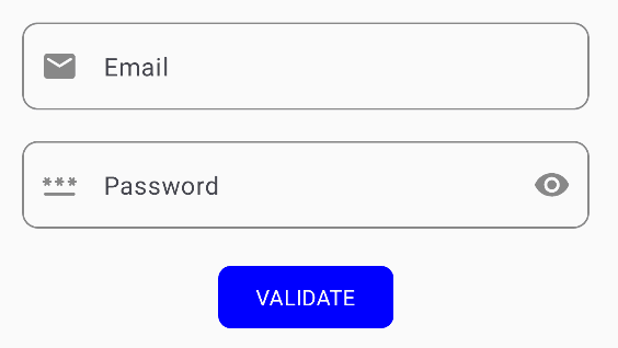
Here is the implementation of TextFieldValidation Component for email and password. Validation will be performed when the button is pressed and clear all focus of TextField with focusManager.clearFocus()
@Composable
fun TextFieldScreen(
    viewModel: TextFieldViewModel
) {

    val focusManager = LocalFocusManager.current

    Column(
        modifier = Modifier.fillMaxSize(),
        verticalArrangement = Arrangement.Center,
        horizontalAlignment = Alignment.CenterHorizontally
    ){

        TextFieldValidation(
            value = viewModel.emailValue,
            onChange = viewModel::setEmail,
            placeholder = "Email",
            isError = viewModel.emailError.isNotEmpty(),
            icon = Icons.Rounded.Email,
            errorMessage = viewModel.emailError,
            keyboardType = KeyboardType.Email,
            modifier = Modifier
                .padding(horizontal = 24.dp)
        )
        Spacer(modifier = Modifier.height(20.dp))
        TextFieldValidation(
            value = viewModel.passwordValue,
            onChange = viewModel::setPassword,
            placeholder = "Password",
            isError = viewModel.passwordError.isNotEmpty(),
            icon = Icons.Rounded.Password,
            isPassword = true,
            errorMessage = viewModel.passwordError,
            modifier = Modifier
                .padding(horizontal = 24.dp)
        )
        Spacer(modifier = Modifier.height(20.dp))
        Button(
            onClick = {
                focusManager.clearFocus()
                viewModel.validateForm()
            },
            modifier = Modifier.padding(horizontal = 2.dp),
            shape = RoundedCornerShape(8.dp),
            colors = ButtonDefaults.buttonColors(containerColor = Blue)
        ) {
            Text(
                text = "Validate".uppercase(),
                style = MaterialTheme.typography.bodyMedium,
                color = White
            )
        }

    }
}
class MainActivity : ComponentActivity() {
override fun onCreate(savedInstanceState: Bundle?) {
super.onCreate(savedInstanceState)
val viewModel: TextFieldViewModel by viewModels()
setContent {
ModtionProjectTheme {
TextFieldScreen(viewModel)
}
}
}
}Output